All components
Impact Title Rules
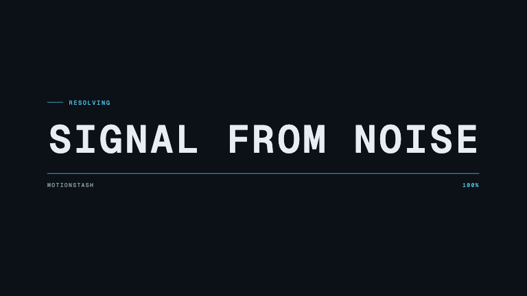
Kinetic typeHeavy uppercase lines whip in from the left with true directional smear, each stepping in and drawing its own accent rule
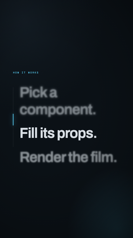
Download preview432×768 preview render — the full-resolution file comes from running the component
5 seconds
Format
This is the format it was composed for. Switch above to see it lay itself out for another — same animation, re-arranged for the frame.
titleimpactverticalmotion blurrulesstaggercaption
For developers — source, dependencies and provenance
Dependencies
remotion@remotion/shapeszod
No Tailwind, no CSS, no asset files. Inline styles only.
Source
Filesrc/registry/items/impact-title-rules.tsx
Frame1080×1920
Duration150f · 5s @ 30fps
Provenance
ToolClaude Code
ModelOpus 5
Authormotionstash
LicenseMIT
Prompt
A vertical title card with two or three enormous uppercase words stacked and stepping in to the right, each with a coloured rule wiping in underneath. The words should whip in from the left fast enough to smear — sample the actual per-frame distance and apply a horizontal-only blur so the letterforms stretch while travelling and are perfectly sharp on arrival. Burned-in caption pill at the bottom.