Comparison Race Chart
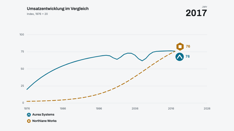
DataTwo series race across fifty points, one solid and one dashed, each carrying a badge and a live figure while a counter runs in the corner
This is the format it was composed for. Switch above to see it lay itself out for another — same animation, re-arranged for the frame.
For developers — source, dependencies and provenance
Dependencies
No Tailwind, no CSS, no asset files. Inline styles only.
Source
Provenance
Prompt
Two series racing across half a century on a fixed 0-110 scale: one solid line for the early leader that keeps stumbling, one dashed for the late entrant whose logistic curve goes straight past it. Gridlines and axis labels fade up first, then both lines draw together over about eight seconds while a year counter runs large in the top-right corner. Each line carries a badge at its leading edge — a disc for the first, a hexagon for the second — with the current value beside it, and the two badges push each other apart when they would otherwise overlap.