KPI Tile Grid
DataStat tiles fade up in a three-frame stagger, counting up in four number formats with delta chips and drawn sparklines
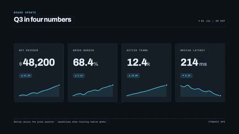
This is the format it was composed for. Switch above to see it lay itself out for another — same animation, re-arranged for the frame.
What you can change — 9 settings
Everything below can be changed without touching the animation. Hand the list to an agent, or edit the values at the bottom of the component file.
- Title *title · string
Board headline, top left. Four to six words — this is the sentence the numbers are evidence for.
now: Q3 in four numbers
- Eyebroweyebrow · string
Small accent label above the title. The report's name or cadence: 'Board update', 'Week 34'.
now: Board update
- Periodperiod · string
Right-aligned mono line on the title's baseline — the window the figures cover, e.g. '01 Jul — 30 Sep'.
now: 01 Jul — 30 Sep
- Tiles *tiles · array
The metrics, in reading order. Four is the designed case and fills a 16:9 row; two or three widen, five or six wrap to a three-across grid.
now: 4 items
- Currency symbolcurrencySymbol · string
Mark set before every 'currency' tile, at half size and quiet. '$', '€', '£', 'CHF'.
now: $
- Sparklinessparklines · boolean
Draw the trailing sparkline in each tile. Turn it off for a denser, figure-only board.
now: true
- Footnotefootnote · string
Quiet mono line at the bottom left, under a hairline — the methodology or comparison basis. One short sentence.
now: Deltas versus the prior quarter · sparklines show trailin…
- Sourcesource · string
Right-aligned attribution opposite the footnote — the team or system the numbers came from.
now: Finance ops
- Brandbrand · string
Brand token id — one of the keys of BRANDS.
now: slate
For developers — source, dependencies and provenance
Dependencies
No Tailwind, no CSS, no asset files. Inline styles only.
Source
Provenance
Prompt
Four KPI tiles in a row on a dark board, staggered in a few frames apart. Each one has a small mono label in caps, a big number that counts up, a little delta chip with an up or down triangle, and a tiny sparkline that draws itself in. Use a different number format on each tile — currency, percent, compact, plain — and make a falling metric still read as good news.


