Line Chart Draw
DataA smoothed trend line draws on behind a travelling dot, filling a soft area as it goes, then annotates its own peak
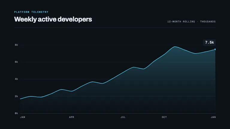
This is the format it was composed for. Switch above to see it lay itself out for another — same animation, re-arranged for the frame.
What you can change — 13 settings
Everything below can be changed without touching the animation. Hand the list to an agent, or edit the values at the bottom of the component file.
- Title *title · string
The metric the chart is about, set large in the top-left. A noun phrase — 'Weekly active developers', not 'Chart of user growth'.
now: Weekly active developers
- Eyebroweyebrow · string
Small uppercase mono label above the title — the dataset, the team, the source. Omit for a barer header.
now: Platform telemetry
- Values *values · array
The series, in order. 8–30 points reads best: fewer looks sparse once smoothed, many more turns the curve into texture. Any magnitude — the y scale is derived from the data.
now: 20 items
- X labelsxLabels · array
Tick labels along the x axis, spread evenly across the series, so five labels can annotate twenty points. Set in mono — keep each to 3–6 characters. An empty array draws no x ticks.
now: 5 items
- Prefixprefix · string
Set immediately before every figure, on the axis and on the travelling readout — a currency mark such as '$' or '€'.
- Suffixsuffix · string
Set immediately after every figure — '%', 'k', 'M', 'ms'. Much cheaper than scaling the numbers themselves.
now: k
- Decimalsdecimals · number
Decimal places on the travelling readout. 1 gives the counter something to do across a small range; 0 for large figures.
now: 1
- Baselinebaseline · "zero" | "auto"
'zero' anchors the y axis at zero — honest for volumes, and the right choice whenever the area is filled. 'auto' zooms to the data range, which suits rates and indices but exaggerates every slope.
now: zero
- Grid linesgridLines · number
Roughly how many horizontal gridlines to draw. The scale snaps to whole 1/2/5 steps, so the count you get back can differ by one.
now: 5
- Areaarea · boolean
Fill a soft accent gradient under the curve, wiped in behind the leading edge. Turn it off for a purer line, or when an 'auto' baseline makes the fill meaningless.
now: true
- Peak labelpeakLabel · string
Caption for the callout that lands on the maximum once the line finishes drawing — 'Peak', 'All-time high', 'Launch week'. The value is appended for you. Omit to leave the peak unannotated.
now: Peak
- Footnotefootnote · string
Quiet mono line in the top-right corner: the period, the unit, the source. A few words — it is set on one line.
now: 12-month rolling · thousands
- Brandbrand · string
Brand token id — one of the keys of BRANDS.
now: slate
For developers — source, dependencies and provenance
Dependencies
No Tailwind, no CSS, no asset files. Inline styles only.
Source
Provenance
Prompt
A line chart that draws itself on: compute a smooth path from a values array, draw the stroke with evolvePath, wipe a soft area gradient in behind the leading edge, and carry a dot with a value label that counts up as it travels. Gridlines and axis labels first at hairline weight, then a small callout on the peak once the line lands.


